Los Angeles is a wonderful city to live in, but it’s not perfect. I like to say that L.A. exists at an equilibrium point because if it was any nicer, we couldn’t handle flocks moving here (although demand is pretty high on that score already). And one of the ways we maintain that equilibrium is something that you can’t help but notice every single day you live here: the architecture.
Clearly our city has an incredible architectural variety of styles and a massive quantity of buildings. The consequence of this is that along with some amazing buildings, projects and public spaces, you’ll find equally disastrous constructions that practically make you want to gouge your eyes out as you drive by.
I have critiqued them for years without ever facing any opposing opinion, probably because no one wants to admit having anything to do with them.
But now, for your viewing displeasure pleasure, I present them to you in one blustering, comprehensive list.
The ten biggest eyesores in Los Angeles. At least according to this man’s opinion.
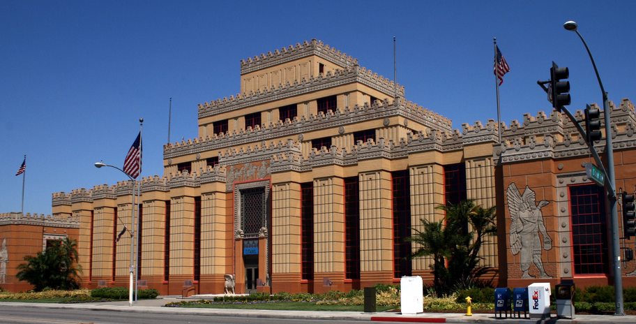
The Citadel
As you drive south on I-5 out of downtown, the best thing you’ll lay eyes on is the former tire factory transformed into a shopping outlet called the Citadel. This Assyrian themed building was designed by the same famed architects that brought us the Mayan Theater. The detail for a project this size goes unmatched in Los Angeles. The mall portion behind the wall is fine, if not anything less than typical. The only problem with the Citadel is when driving at night..(switch to your monster truck reading voice) Forty foot LED advertisements! Glaring signs hotter than a supernova! Dodge cars while you avoiding this flaming inferno!(back to your Coldplay reading voice) It’s distracting and dangerous to drive through there. Makes we wonder why we have laws prohibiting the use of laser pointers.
Geoff Palmer Collection
The Medici. The Orsini. The Piero, the Visconti or whatever new crap is coming. If I specifically had to name one, then it would be whatever was the last I laid eyes on. These buildings may be something you’d be proud of if you live in Riverside, Barstow or Jacksonville, but not Los Angeles. The stucco exteriors along with their gaudy features are counter to the aesthetic downtown. The living units are perched high above street level making them virtual fortresses with businesses refusing to occupy the first floor. They look like some designer took plans from a McMansion and used the scale tool. I have yet to meet a person claiming they live there.
Westwood Medical Plaza
This building was designed by noted architect Paul R. Williams in 1961. It’s not one of his best, but that’s not my beef with it. It’s the large super graphic and what it represents. These type of advertisements were not supposed to be permitted, but found passage through some backdoor methods. In the early part 2001, Jon Muller, the building’s owner, tried painting an advertisement for Pearl Harbor(the movie) without a permit. The city council immediately forced him to take it down, but right after 9/11, another mural was painted with an innocuous patriotic theme. We were so wrapped up with Toby Keith that we did nothing as it morphed into an advertisement. Next thing you knew, those 1969 Statue of Liberty murals popped up all across the city trying to same tactic. So while the signage of Westwood Medical Plaza may not be ugly, it’s the principal!
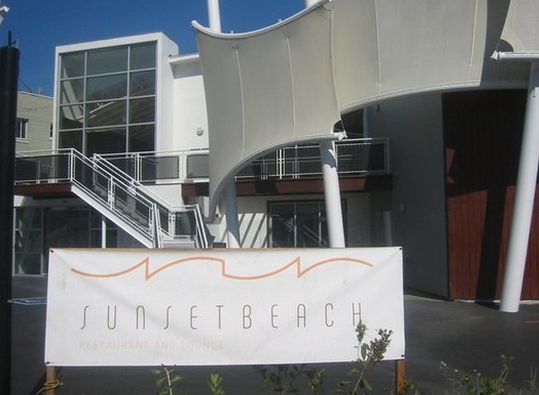
Sunset Beach
The Sunset Strip used the be the focal point of nightlife activity, but its popularity waned as it tried to hold onto that glory. Some will remember Dublin’s, a dark and disorienting haunt that attracted a good crowd of twenty somethings. Most didn’t miss it when it closed, but now we yearn the day until time travel is in our grasp. Sunset Beach brought a 1990’s theme while they had no clue it was 2007. With its colorless facade and curved canopies, the building is the definition of forced blandness. I don’t even think it was open for more than a month. To quote Chris Rock, “Grand Opening. Grand Closing.” If there ever was a building that signifies the death of Sunset Strip’s livelihood, this is it.
The Blue Whale
Cesar Pelli is a great architect capable of designing work that inspires. The original portion of the Pacific Design Center does just that, but instead motivates you to gag. The Blue Whale is the best moniker I would choose because of its large size and lack of any other color. To be fair, I don’t hate the green or red additions as much because their transparency doesn’t make them appear as flat. I also think it’s cool that this was a project realized over 35 years, like the crap Richard Linklater puts out. But still, every time I look at Moby Dick, I think it one of those buildings that seems out of place in films and a few scenes later, it gets blown up. Robocop, we need you.
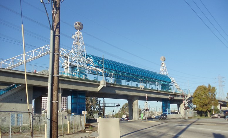
Redondo Beach Metro Station
I know the first thing you’re thinking, Redondo Beach has a rail line? Well yes, but just barely out of some creative gerrymandering. You can have a beef that most of the station actually lies in Hawthorne, but it’s not as bad as calling yourself the Los Angeles Angels of Anaheim. For visual purposes, the station sadly sits across Marine Avenue using from what I assume are discarded pieces from the 80’s show Buck Rogers. If there was any white framing left over from the Convention Center, it found its way here. There are a couple of spires that are supposed to reference oil derricks? It’s a question you don’t want answered. Also depressing, the Green Line abruptly stops here as if construction was still pending. If someone told me they were dismantling the station, I’d believe it.
The Los Angeles Mall
This list could have consisted just of shopping malls, but the Los Angeles Mall is my favorite. Favorite to hate, that is. Experiencing it makes you feel like we lost the Cold War. The design is impersonal and you leave scratching your skin trying to rid yourself of asbestos. Things seem off kilter enough that you’d think the business are phony copies of legitimate ones, like when you find $25 Oakleys online. I’ll give the architects credit for submerging it from the street. I like the Triforium just because it makes me feel educated saying the word. The site wouldn’t receive so much hatred if it still contained the Children’s Museum. Which brings me too…
Discovery Cube Los Angeles
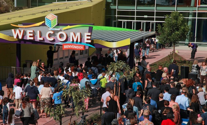
When the Children’s Museum of Los Angeles closed in 2000, it was to be replaced by two new buildings, one in Little Tokyo(never built) and the other in Hansen Dam. Construction on the latter began in 2005, but didn’t open until the end of 2014. That delay may explain why the design looks slightly dated, but who you ever think that the metallic veneer would inspire our future? The building reminds me of(*this portion of the rant has been omitted due to its graphic nature*) which is how ground beef is made. I guess it’s nice that this part of Los Angeles got some recognition from the city, but the building doesn’t fit the environment. I don’t know if it’s all the horseback riding or the wash, but Hansen Dam always seems dusty, like you’re looking through the Crema filter on Instagram. They would have been better off building an ant hill rather than this sling blade.
Baldwin Hills Oil Fields
Travelers arriving in L.A. may not get the best first impression coming out of LAX. If you really want to leave a bad taste of reflux in their mouth, head up La Cienega on the way out. These sprawling hills are covered with drills and dug out holes that makes you think that the Terminators won. It’s hard to determine the existence of lifeforms due to the constant haze swept up from the dust. I often wonder what other major city in the world has such a monstrosity right in the middle of it? Luckily, it’s mostly tucked into the hills so it’s hidden from afar, but still I worry that Skynet has become self-aware.
8500 Melrose
Noted as one of the ugliest buildings in the country, every list must include this homage to tastelessness on the corner of Melrose and La Cienega. The largess of the black and white striping makes you think it should be Sephora’s headquarters. This catastrophe has served West Hollywood since the 1980’s, an era beloved for its kitschiness, but even taste has its boundaries. The good news is that a pharmacy occupies the ground floor if you experience motion sickness.
Have any ‘least favorite’ buildings in Los Angeles that make you want to avert your eyes? Let us know how you feel in the comments below!
Zachary Rynew has touched Los Angeles in many ways. For years he helped visualize many of the city’s major projects (LA Live, Hollywood Blvd., Metro Rail, UCLA) and had his work featured at the Getty. He was a winner at the LA Improv Comedy Festival and ran in five LA Marathons. Now, he travels the city by bike and couples his local knowledge with his sports writing experience to bring you a different look at the blurs we normally pass by.


